
4.23% higher click-through rate on product overview pages thanks to self-learning ranking at A-Z Gartenhaus
A-Z Gartenhaus increased the click-through rate on product overview pages by more than 4% using a self-learning ranking system.
In e-commerce, over 95 percent of visitors leave the online shop without converting.¹ That's a lot of users who leave without buying anything. To increase the conversion rate, it's worth taking a look at the user guidance. How easy is it for visitors to find their way around your shop? Can they find the product they want with just a few clicks? In this article, we'll look at the basics of intuitive user guidance and show you how you can improve it using seven building blocks.

Here's what you can expect to find in this blog article:
User guidance – A brief definition
User guidance in the context of usability and customer experience
Why intuitive user guidance is important in online shops
7 building blocks for good user guidance in your shop
#1 Responsive design
#2 Meaningful page structure and navigation
#3 Emotional appeal through first-class photos
#4 Optimal placement of important links
#5 Clear product detail pages
#6 Faceted navigation
#7 Intelligent product search
Conclusion: Intuitive user guidance keeps customers in your shop
User guidance is a key element in every online shop. With intuitive modules on the user interface, you can help website visitors navigate your shop and click their way through the ordering process as easily as possible.
Can customers quickly find the products they are looking for and complete the purchase process? Or do they leave the online shop frustrated because the selection process involves too many steps? In short: the design of the user guidance determines the success or failure of your potential customers' purchasing behavior.
A user-friendly online shop is essential for attracting potential buyers to you and your business. The requirements that your shop should meet for this are summarized under the term usability. User guidance is an important component of usability. In addition, the optimal design of the user interface, fast loading times, seals of approval such as Trusted Shops, and the display of customer reviews play an important role.
The term "customer experience " encompasses all the impressions a person gains from a company during the course of their customer relationship. This includes both personal perceptions and all interactions at the various touchpoints. Your online shop is an essential point of contact for your customers. By offering shop visitors intuitive user guidance, you ensure a positive customer experience. This in turn strengthens the relationship between you and your customers.
The average purchase rate in e-commerce is between 2 and 5 percent.¹ Well-designed online shops, on the other hand, can achieve conversion rates of up to 30 percent.² That's an average of 10 times more orders, which generates significantly more revenue. Usability and user guidance play a decisive role in this. Even small improvements in user guidance can increase your customers' purchase rate and thus benefit you from higher sales.
In addition to the financial benefits of good user guidance, you also achieve something much more important: satisfied customers who are happy to return and recommend your store to others.
Stay up to date on personalization: Sign up for the Epoq newsletter. Register now!
There are many ways to optimize user guidance in your online store. We will introduce some of them below:
In 2021, 60 percent of internet users in Germany were already using their smartphones to shop online.³ Laptops, desktop PCs, and tablet PCs are becoming less and less important in this context. That's why it's essential that your online shop is optimized for mobile devices and offers the same intuitive user experience as on a larger screen.
This not only ensures a pleasant user experience, but also improves your Google ranking. Since March 2021, Google has been crawling all websites with its smartphone bot and evaluating them according to the "Mobile First Index."⁴ This means that only the mobile versions of the pages are taken into account for the ranking.
But responsive design means even more than that. Due to the special feel of mobile devices, the mobile UI should also be designed according to the "thumb first" principle. Many online shops and websites are starting to place important elements so that they are easy to reach with the thumb. For example, the search buttons or chat button can be arranged so that the user of the device can reach them easily.
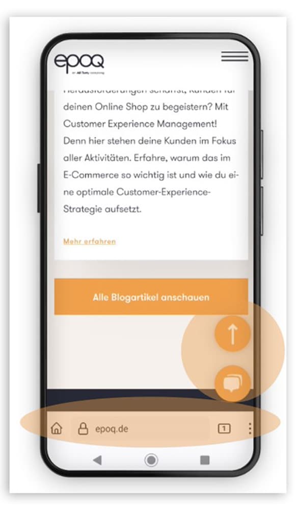
By placing the icons in the lower area, they are easy to reach with your thumb. (Source: Screenshot from epoq.de)
The basic structure of your shop is important in helping visitors quickly find their way around your site. It should contain all the necessary elements while still being coherent and clearly structured. If you would like to learn more about how to build a meaningful navigation structure and how to integrate personalization, please take a look at our article Well-designed navigation structure for better orientation in online shops.
Shop customers are used to websites having a hierarchical structure. The navigation should have a maximum of nine items. However, it is better to have fewer than seven so as not to overload the page unnecessarily. Shop visitors should be able to reach the desired subpage in a maximum of two or three clicks using this navigation.
In most cases, a tree structure is recommended for online shops: the content and products are grouped into logical units and linked to each other according to theme. Breadcrumbs at the top left of the page let shop visitors know where they are at all times. The individual elements are linked so that they can return to the relevant top-level category. In the NKD online shop, for example, it looks like this:
Home / Living & More / Household goods / Kitchen gadgets
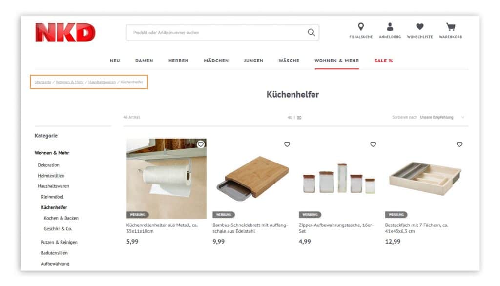
Linked breadcrumbs let customers in the NKD online shop know where they are at any time and allow them to return to the top category with a single click.
(Source: Screenshot from nkd.com)
Whether on the Home, in the flyout menu, or on the product detail pages, High-quality product photos appeal to shop visitors on an emotional level. and provide them with guidance. On the Home page of the Villeroy & Boch online shop users see, for example, a seasonal product made of porcelain that has been lovingly staged. This immediately shows customers what kind of products are sold in this online shop.
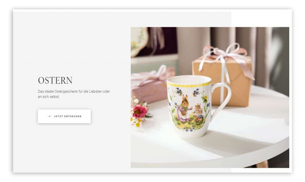
High-quality product photos on the homepage of the Villeroy & Boch online shop appeal to customers on an emotional level
(Source: Screenshot from villeroy-boch.de/shop/)
Links are also important elements of intuitive user guidance. They can appear in the shop in the form of CTAs, text links, image content, or icons. Users should be clear about what they can expect from the interactive elements. For example, if you place a plus sign (+) under a section with product details, clicking on it should reveal further information about the product.
In addition , users have learned where certain elements are located in an online shop. The shopping cart usually appears at the top right, as do buttons for logging in or registering. Shop visitors expect the language selection to be located at the top center or on the right.
By following these classic shop layouts, you make it easier for your potential buyers to navigate your site. However, check the layout regularly, as expectations can change over time.
Once shop visitors have found a product that interests them, they want to learn more about it on the detail pages. Here, Classic user interface designs have also proven themselves: This is how potential buyers find the information in the familiar locations. So make sure your shop is always clearly structured and stick to what visitors know and expect when it comes to certain elements. For example Product images, CTAs, product details, and recommendations on product detail pages always arranged in a similar way. With additional Calls to action such as "Add to cart" or "Order now" you also make it easier for your shop visitors to complete the purchase process.
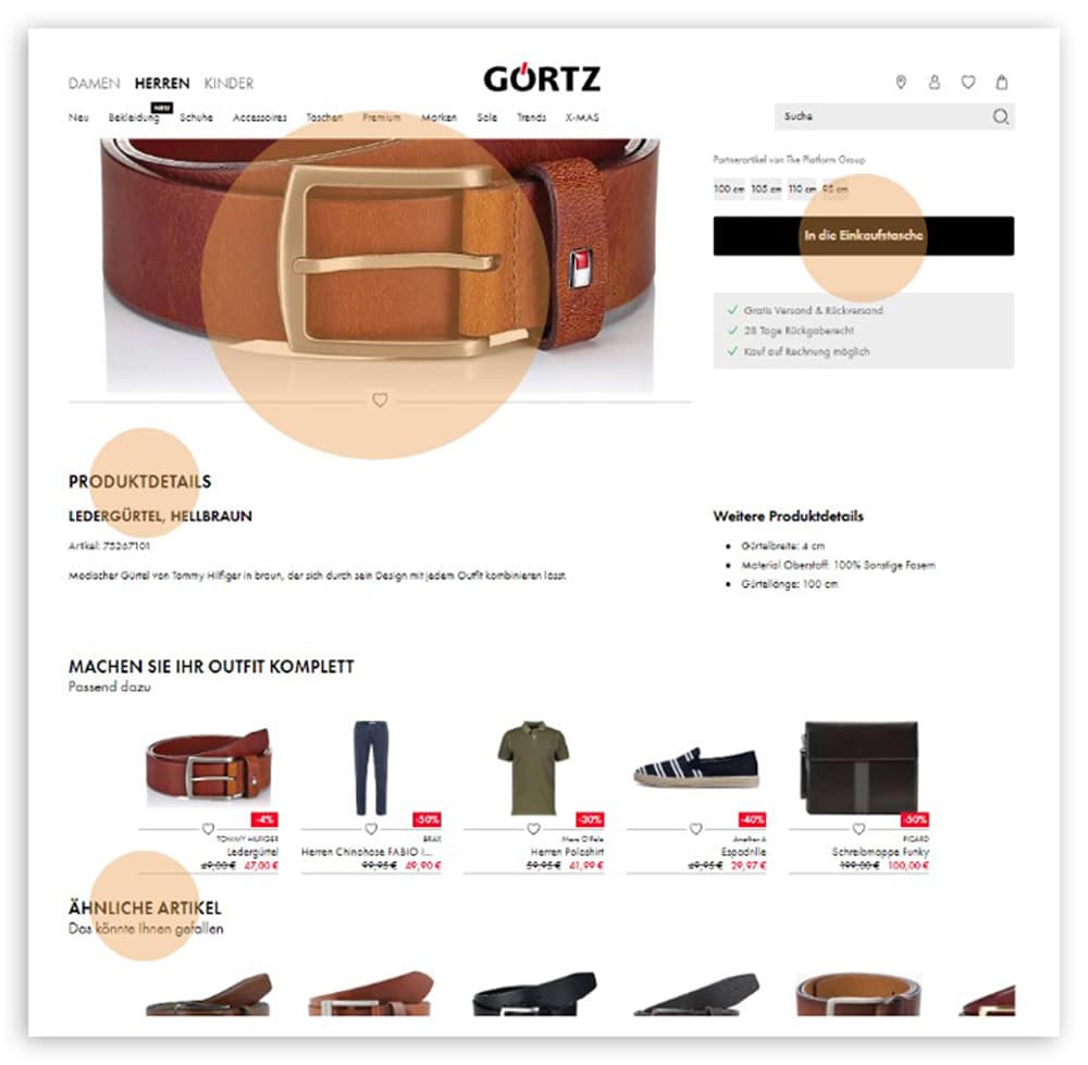
The intuitive layout of the elements makes visitors feel comfortable and helps them quickly find their way around your shop. (Source: Screenshot from görtz.de)
You can improve the user experience on your website with another building block: the Faceted NavigationThis element allows your shop visitors to narrow down the wide range of your products according to individual criteria. In contrast to a simple filter, this selection function allows users to combine multiple filters, e.g., size 39 sandals for a festive occasion that cost less than €50 and are available for immediate delivery. This allows you to Reduce product selection from hundreds or thousands of shoe models to just a fewThis makes the selection process much easier for potential buyers.
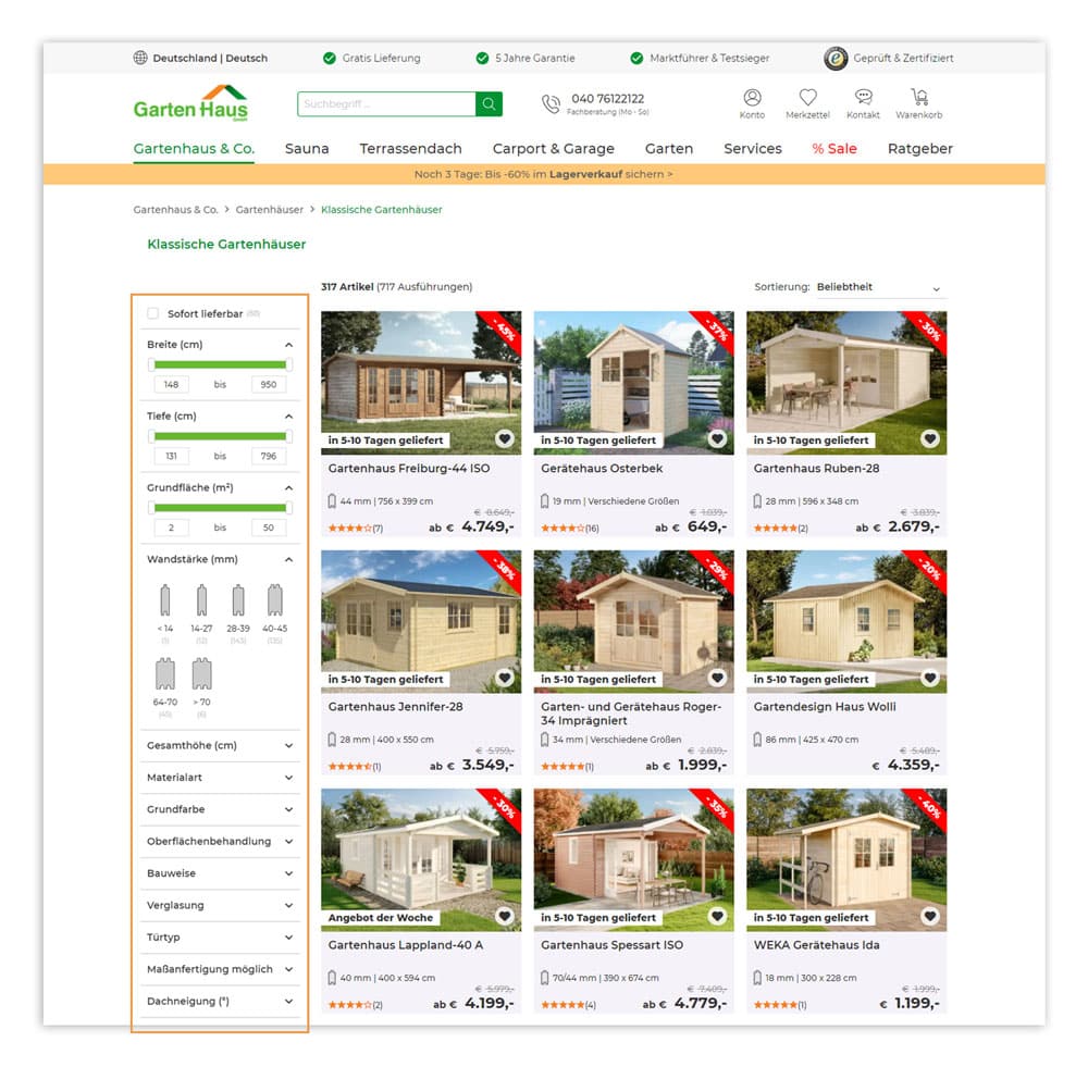
In the Gartenhaus online shop, customers can narrow down the product selection using faceted navigation to find the desired product features
(Source: Screenshot from gartenhaus-gmbh.de)
Shop visitors are impatient creatures. That's why they want to find the product they want as quickly as possible. Otherwise, they will abandon their visit and you will lose a potential sale. For optimal user guidance, you should not only place the product search in your online shop in a central and clearly visible location, but also use an ecommerce search engine function.
Users are accustomed to finding the search field in the header of the online store. It should be visible on all product-related pages. This is the best way to attract visitors.
With an intelligent product search, shop visitors can quickly find the product they want, even if they don't know the exact name. The autosuggest function helps here by suggesting suitable products and words from different categories. These are displayed in a window below the search bar and can be easily selected.
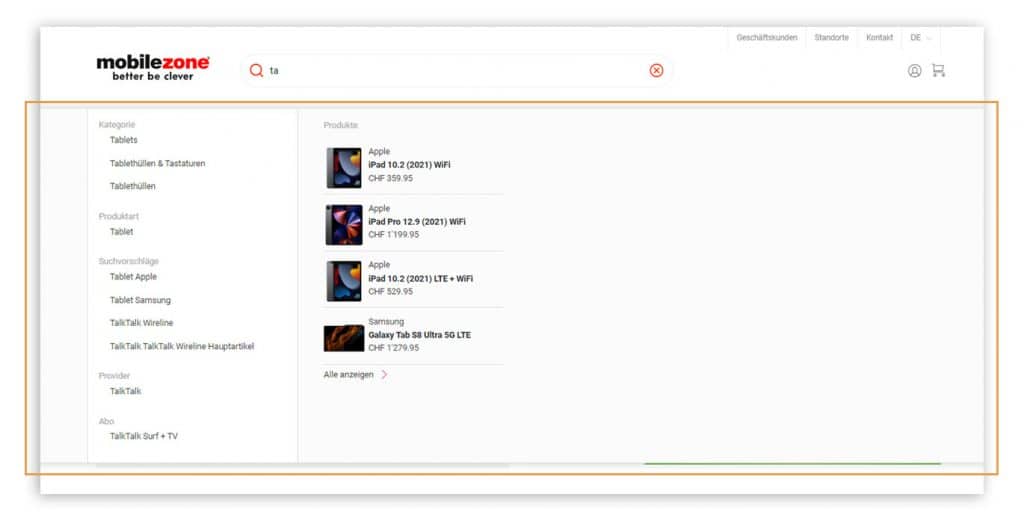
In the mobilezone online shop, customers receive relevant search suggestions as soon as they start typing in the search field, including products and categories.
(Source: Screenshot from mobilezone.ch)
In addition, an error-tolerant search helps shop visitors: the search algorithm also accepts terms with typos if the tolerance is set high enough. Users receive relevant results even if they have entered "handbag" instead of "handbag," for example.
Stay up to date on personalization: Sign up for the Epoq newsletter. Register now!
In semantic search, artificial intelligence supports users by recognizing their natural language. It considers the context of a search query and can thus show shop visitors relevant results. For example, when the user enters "men's winter jacket," the algorithm suggests all men's winter jackets available in the online shop.
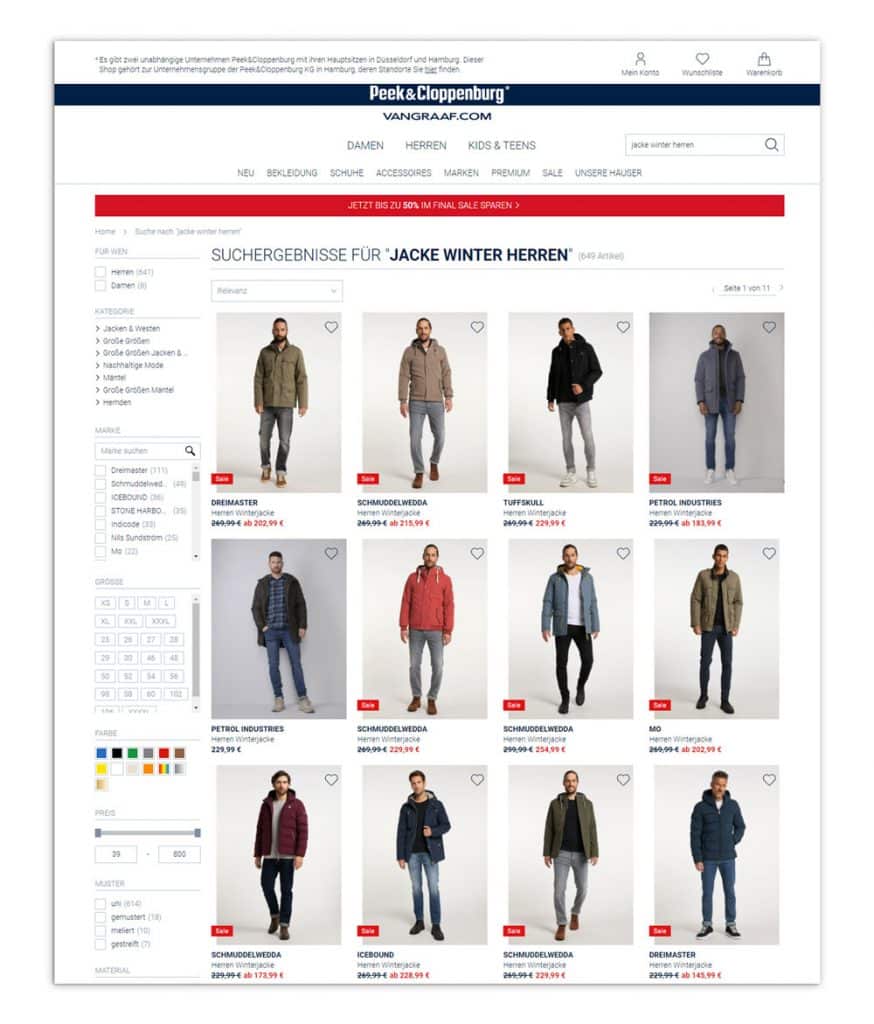
Thanks to semantic search, customers receive relevant results for their search query "
" (Source: Screenshot from peek-und-cloppenburg.de) in the Peek&Cloppenburg* Hamburg online shop.
The topic of user guidance deserves attention in every online shop. After all, it plays a decisive role in the number of purchases made. The easier it is for your shop visitors to find their way around your website, the more likely they are to add the desired products to their shopping cart and decide to make a purchase. Therefore, always consider your customers' journey and pay attention to the structure of your mobile shop view. If you are unsure how intuitive the user guidance in your shop is, have your website tested by friends or professional agencies. After all, there is always room for improvement.
Sources: ¹ HubSpot, ² Online Marketing Praxis, ³ Statista, ⁴ Google Developers
Want to know how Gartenhaus increased the click-through rate on product overview pages by more than 4%?
Check out the case study!

You are currently viewing placeholder content from HubSpot Embedded Content. To access the actual content, click the button below. Please note that doing so will result in data being shared with third-party providers.
More InformationYou are currently viewing placeholder content from HubSpot. To access the actual content, click the button below. Please note that doing so will result in data being shared with third-party providers.
More InformationYou are currently viewing placeholder content from HubSpot Meetings. To access the actual content, click the button below. Please note that doing so will result in data being shared with third-party providers.
More Information