
Reduce bounce rates – with ecommerce search engine
In a web demo, we will show you how you can reduce the bounce rate in your online shop using various live examples.
If a website user is looking for a specific subpage, you should help them out with a well-thought-out navigation structure and offer guidance. Because if they can't find what they're looking for in your shop, they'll move on to your competitors. In this article, you'll learn why good navigation is crucial in an online shop, what the optimal navigation structure for your website looks like, and what types you can use.

Here'swhatyou can expect to find in this blog article:
Definition: What is a navigation structure?
Why is the navigation structure so important in e-commerce?
Positioning on the website: The most important types of navigation
Horizontal navigation bar
Vertical navigation bar
Horizontal footer navigation
How should the navigation structure be designed?
Six tips for a well-designed navigation structure
Conclusion: Create a well-thought-out navigation structure for better orientation
Frequently asked questions about the navigation structure in the online shop
The navigation structure of your website or shop is a bar that guides visitors to the desired subpage or landing page. It displays at least the main categories of your online shop, but is usually further subdivided into subcategories.
The navigation structure is visible on every subpage of the website and is always identical. This provides your visitors with a secure framework for using the site.
Visitors who arrive at the desired landing page via search engines or use the shop's onsite search function require little additional assistance with navigation. However, the situation is different for users who want to click their way through the site first. They need well-designed user guidance in the online shop to help them quickly find what they are looking for.
Stay up to date on personalization: Sign up for the Epoq newsletter. Register now!
If you are unable to create an intelligent navigation structure, searching for a specific subpage can be frustrating for users. Visitors will leave your shop, and your bounce rate will increase. Well-structured and intuitive navigation in your online shop is therefore crucial for reducing your bounce rate.
Tip: Learn how you can further reduce your bounce rate in our guide to lowering bounce rates in online shops.
The navigation should meet the expectations (and habits) of your visitors. Based on this, you can place the navigation structure in three different positions on the website:
Traditionally structured online shops display their navigation above the actual content. This is because many internet users are accustomed to this type of navigation bar. It is always visible, yet remains compact and discreet in the background.
However, the horizontal navigation concept has one disadvantage: due to the limited width of the screen, you cannot display an unlimited number of subcategories. It is also difficult to display on mobile devices with a vertical display orientation.
Two examples of horizontal navigation structures:
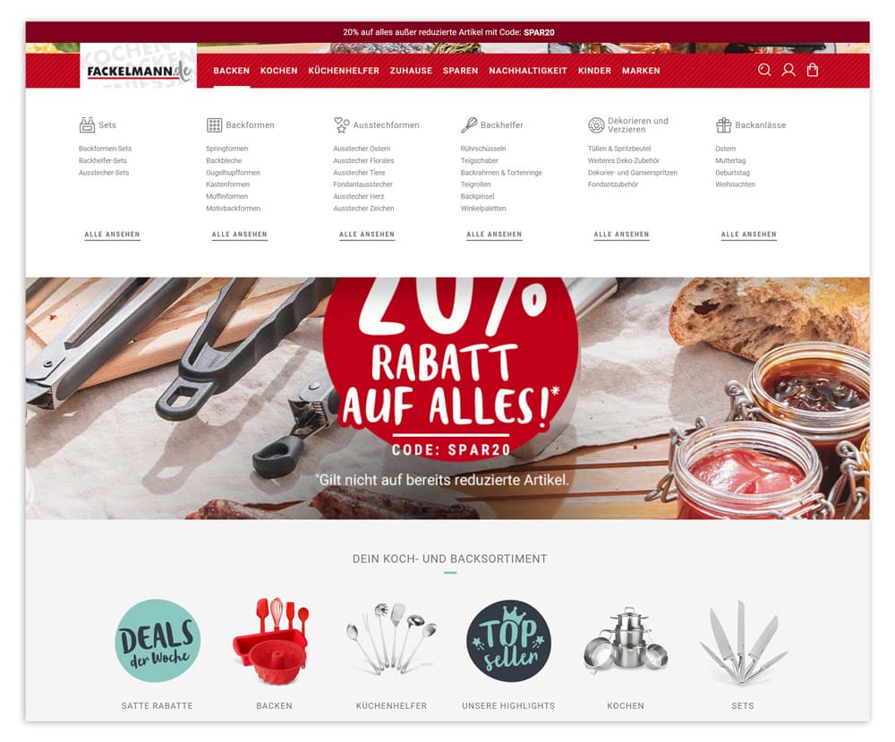
Fackelmann uses a horizontal navigation structure in its online shop to provide a good overview of all categories.
(Source: Screenshot from fackelmann.de)
Vertical navigation structures are rapidly becoming more prevalent as more users utilize mobile devices with vertical displays. The website menu is typically located to the left or right of the content and can generally be expanded as desired. However, ensure that it remains manageable in size, otherwise users will have to scroll excessively.
The advantage here is that you can use the entire height of the website for your content. However, the visible area of your online shop will be significantly restricted.
Three examples of vertical navigation structures:
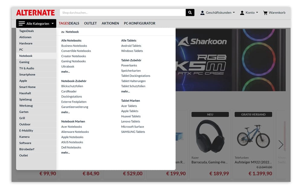
When a customer clicks on the burger menu in Alternate's online shop, the vertical navigation structure opens with all shop categories.
(Source: Screenshot from alternate.de)
Tip: Faceted navigation provides additional user guidance in addition to classic menus. Faceted navigation offers a variety of filter options on a category or search results page according to various desired characteristics. With the help of these, shop customers can narrow down their product selection with just a few clicks. The filters offered can be customized from category to category or depending on the search query, so that customers only ever see relevant filter options.
Footer navigation is generally not suitable as the main navigation. However, it has become a standard feature of a well-structured website. Visitors can quickly find the most important links here. In an online shop, these could include the most frequently requested product categories, information on shipping and returns, or a link to the FAQ.
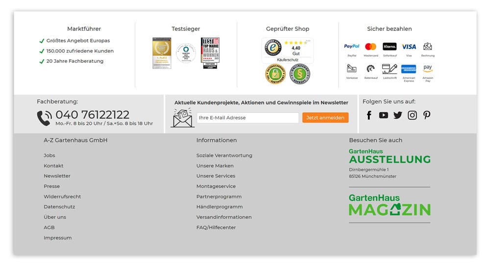
In the footer navigation at A-Z Gartenhaus, customers can find all the important links to further information, such as brands, shipping, or FAQs.
(Source: Screenshot from gartenhaus-gmbh.de)
Are you wondering in which order you should display the individual categories in the navigation structure? There are several approaches to choose from:
Stay up to date on personalization: Sign up for the Epoq newsletter. Register now!
Want to create a navigation structure that perfectly guides your visitors? These six tips will help you do just that:
If you want to offer your visitors the best possible customer journey and reduce your bounce rate, you should ensure that you have a sensible navigation structure. Choose the type of navigation that suits your shop, place it in line with the expectations of your shop visitors, and tailor it consistently to their needs. With navigation tailored to the user, you can provide orientation and keep your customers in your shop.
Source: ¹t3n
The three-click rule is a recommendation for navigation design. It states that users should be able to access all content from the home page with a maximum of three clicks.
Want to learn how to reduce your bounce rate?
Schedule a web demo now.

You are currently viewing placeholder content from HubSpot Embedded Content. To access the actual content, click the button below. Please note that doing so will result in data being shared with third-party providers.
More InformationYou are currently viewing placeholder content from HubSpot. To access the actual content, click the button below. Please note that doing so will result in data being shared with third-party providers.
More InformationYou are currently viewing placeholder content from HubSpot Meetings. To access the actual content, click the button below. Please note that doing so will result in data being shared with third-party providers.
More Information